In today’s data-driven world, the ability to effectively communicate complex information is essential for businesses, educators, and professionals across industries. Data visualization plays a crucial role in transforming raw data into meaningful insights and compelling narratives. However, creating visually appealing and informative visualizations can be a daunting task, especially for those without a background in design or data analysis.
Enter Visme – a powerful yet user-friendly data visualization tool that empowers users to easily create stunning charts, graphs, and other visualizations to convey their message effectively. With its intuitive interface and robust features, Visme simplifies the process of data visualization, enabling users to transform even the most complex information into compelling visual stories for presentations, reports, infographics, and more.
Understanding the Importance of Data Visualization
Before delving into how Visme revolutionizes data visualization, let’s first explore why visualizing data is so important. In today’s fast-paced world, audiences are inundated with information from various sources, making it challenging to capture and retain their attention. Data visualization offers a solution by presenting information in a visually engaging format that is easier to understand and interpret.

By translating data into visual elements such as charts, graphs, and infographics, data visualization enables viewers to grasp key insights quickly and make informed decisions. Whether it’s analyzing sales trends, presenting survey results, or illustrating demographic data, visualizations help simplify complex concepts and enhance comprehension.
Introducing Visme: A Game-Changer in Data Visualization
Visme is a versatile online tool that empowers users to create professional-quality visual content without the need for graphic design expertise. With its drag-and-drop interface and extensive library of templates and assets, Visme makes it easy for anyone to design stunning visualizations that captivate audiences and convey information effectively.
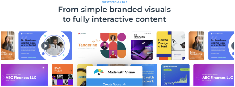
One of the standout features of Visme is its wide range of customizable charts and graphs. Whether you need a simple bar chart to compare sales figures or a sophisticated bubble chart to visualize market trends, Visme offers a variety of options to suit your needs. Users can easily customize the appearance of their charts by adjusting colors, fonts, labels, and other elements to match their brand or presentation style.
Simplifying the Data Visualization Process
Creating visualizations with Visme is incredibly straightforward, thanks to its intuitive design and user-friendly interface. Users can start from scratch or choose from a selection of pre-designed templates tailored for various purposes, such as sales reports, marketing campaigns, educational presentations, and more.
Once a template is selected, users can simply drag and drop data directly into the visualization tool or import data from external sources such as Excel spreadsheets or Google Sheets. Visme’s smart data import feature automatically generates visualizations based on the imported data, saving users time and effort.
Customization and Personalization
One of the key advantages of Visme is its extensive customization options, allowing users to tailor their visualizations to meet their specific needs and preferences. Whether it’s adjusting the layout, color scheme, typography, or adding annotations and icons, users have full control over every aspect of their visualizations.
Moreover, Visme offers a vast library of high-quality graphics, icons, and images to enhance visualizations and add context to the data. Users can choose from thousands of professionally designed assets or upload their own images to create truly unique and impactful visual stories.
Collaboration and Sharing
Another notable feature of Visme is its collaboration capabilities, making it easy for teams to work together on projects in real-time. Users can invite collaborators to review and edit visualizations, leave comments, and track changes, ensuring seamless communication and collaboration throughout the design process.
Once a visualization is complete, users can share it with their audience in various formats, including interactive presentations, animated videos, PDFs, and more. Visme’s built-in analytics tools allow users to track engagement and gather valuable insights into how their visualizations are being received.
Conclusion: Empowering Visual Storytelling with Visme
In conclusion, Visme is a game-changer in the world of data visualization, offering a powerful yet accessible platform for creating stunning visualizations that captivate audiences and convey information effectively. Whether you’re a business professional, educator, marketer, or designer, Visme provides the tools and resources you need to bring your data to life and tell compelling visual stories.
With its intuitive interface, customizable templates, and extensive library of assets, Visme simplifies the process of data visualization, enabling users to transform complex information into engaging visual narratives for presentations, reports, infographics, and more. Whether you’re a novice or an experienced designer, Visme empowers you to unleash your creativity and communicate your message with impact.
